Friday, October 23, 2015

2015-16 NHL Season's New Jerseys

The current 2015-16 NHL season has seen the most jersey changes and additions since the Reebok Edge System took the league by storm in 2007.  Some of the changes are beautiful, while others not so much.  In this article we will be breaking down each new jersey with a rating out of five to explain the overall rankings featured at the end of the article. 

The Anaheim Ducks 
4/5
The Ducks are truly going back to their roots with their new orange alternate which features the beloved Anaheim Mighty Ducks logo from back when Disney owned the franchise.  This blast from the past complements their new gold, black, and orange color scheme very nicely, appealing to both eras of the team's fan base.  The only aspect that is offsetting is the lack of a thin orange stripe in the base pattern like the ones part of the sleeve stripes. 

Arizona Coyotes

2.5/5
For a team with a quality logo and the only variation of maroon as their primary color, the Coyotes had a great opportunity to correct their old simplistic design, but instead they did the opposite.  There is so much wrong with these new uniforms, starting with the sleeve design.  The tri-colored sleeve distracts from the rest of the uniform and takes away from their logo's intimidating presence.  Additionally, their away socks contain mostly maroon and black, not white.  There is an unwritten rule in hockey that jerseys and socks must be the same color, unless you are the Boston Bruins of course (an original six franchise).  Overall, Arizona transitioned from a far too simplistic design to a far too complicated one.  Hopefully they will be able to find a happy medium in the near future.   

Colorado Avalanche

 4/5
With a fantastic modernization of the historic Colorado Rockies logo, the Avalanche have created a third jersey worth purchasing.  Not only does this design speak to nostalgia, it also reconnects the distanced franchise with the new young and elite Avalanche team of the present.  They have also incorporated the "C" portion of the triangular logo onto the shoulder yokes of their primary uniforms, replacing their famous yet controversial big foot logo. 

Edmonton Oilers

4.5/5
The third jersey all hockey fans have been waiting for the Oilers to wear has arrived.  Orange has been just as big of a color as blue since the franchise's founding, so it is nice to see it finally receive the precognition it deserves.  The traditional two-colored stripes located on the sleeves and on the base of the uniform, along with the placement of the sleeve numbers on the shoulder yokes rather than the sleeves themselves, give this alternate jersey a retro feel that brings with it a reminiscence of the Gretzky dynasty days.  
New York Islanders

2/5
I do not know what it is with the Islanders and black, but after another try with it as their third jersey's primary color, you'd think they realize enough is enough.  Not only is this jersey bland, plain, and completely lacking of blue and orange, it is a disgrace to the Islanders' history and dynasty years.  They claim the four stripes featured on the sleeves and socks represent their four cups and glory days, but we all know that it is really just a public relations stunt to get fan approval for a jersey obviously marketed towards Brooklyn Nets fans and not Islanders followers.  Instead of the Islanders worrying about creating a fresh Brooklyn image so they can "fit in" at their new Arena (Barclays Center), they should be flaunting their historic blue and orange colors to win Brooklyn over that way. 

Washington Capitals
3.5/5
The use of the correct shade of red, white, and blue is finally being used in a Capitals jersey.  This bright, patriotic rendition of their old primary jersey really "pops" on TV and immediately sends the message that this team is from the capital of the United States.  The only thing keeping this jersey from scoring higher is the fact that it is basically a reverse of their previous white third jersey that they wore in the 2011 NHL Winter Classic.


2015-16 New Jersey Rankings
  1. Edmonton Oilers 
  2. Colorado Avalanche 
  3. Anaheim Ducks
  4. Washington Capitals 
  5. Arizona Coyotes 
  6. New York Islanders

Sunday, August 30, 2015

A Brief History: Barclays Premier League Championship Badge


Every league around the world displays its logo on the kits of all their teams during league play.  This is most commonly done towards the bottom of the shoulder yokes.  In the Barclays Premier League, the previous year's champions get a little something extra, however.  Instead of repping the league's standard badge with a white filler, they get one with gold.  As most of the game's quirks in Europe go, this touch of gold, although minor in the grand scheme of things, adds more to the prestige that comes with winning in a top league.... making this BPL tradition one worth continuing.  

Standard Premier League Badge
Champion's Gold Badge

Saturday, August 15, 2015

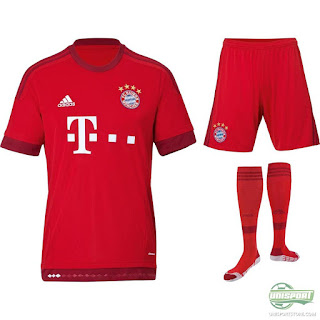
FC Bayern Munich 2015/16 Home Kit


As one of the world's top clubs, FC Bayern Munich of the German Bundesliga, always have millions of eyes set upon them when their new season kits are released each year.  When a top club releases a kit that displeases or breaks long standing tradition their is an expected backlash.  Bayern, however, have done an overall excellent job this year dramatically changing their design from years past while simultaneously maintaining their historic tradition and colors.

Last season they sported a home kit that popped on the TV screen due to its array of vertical blue and red striping.  For the new year, in a simplistic fashion, Bayern have rid themselves of striping all together and are going with a far more simplistic design that features just two shades of red.  The bulk of the kit, ranging from socks to shirt, is coated in their signature fiery red, with a darker variation of it lining the ends of the sleeves, bottom of the shirt, and the Adidas™ piping.  

Although this new variation of red is new to the Bayern kit family, it does an excellent job bringing out the brightness of their classic red, which adds a major intimidation factor to the kit.  An additional benefit of just the two shades of red is how it forces the blue in the team crest (featured on both the shirt and pants) to pop out far more than it would if it was surrounded by blue striping.  Red is the club's primary color, but blue has been such an iconic color of their history for many years past, so even though the designers eliminated the blue stripes, they obviously knew how to keep blue a notable color of the club's kit.   

Overall, these unsophisticated 2015/16 FC Bayern Munich home kits really please my creative side as their simplicity really grabs the eyes of viewers in a complex fashion. 
 

Tuesday, August 11, 2015

The Return of The Jersey Closet - Our New Look and Feel

After nearly a year, The Jersey Closet is back and is returning with a revamped look and feel.  Our signature ice hockey articles critiquing, commenting, and complimenting various NHL and international jerseys will return in full force just as before, but we are proud to announce the addition of the world's most popular sport, soccer, to TJC.

I decided to try my luck at watching a Barclays Premier League match between Everton and Aston Villa one snowy winter day, and was instantly hooked to the sport.  I quickly realized how unique the sport was compared to our typical American sports, especially the fact that a league is won by the team who finishes the season with the most points, a system completely void of playoffs.  Then, of course, I was introduced to the European Kit (soccer terminology for jersey) system.  When I found out every single team, no matter the league nor ranking, released a whole new rotation of kits each and every season, I knew soccer had a place on TJC.

With hundreds of soccer clubs around the world, each with new kits every season, we will be covering the thrilling sport and its unique kit system year round on TJC.  We feel the balance between Hockey and Soccer will not only add a much needed variation to our site, but will also inspire us as writers to look at the two sports and their apparel from the perspective of the other one and provide you with a reading experience unique from any other sports website on the internet.

We hope you are all just as excited as we are as The Jersey Closet continues to evolve for the better! 

Saturday, March 1, 2014

Review: NHL Heritage Classic Jerseys

In the 2014 NHL Heritage Classic, the Vancouver Canucks and the Ottawa Senators will go head to head while wearing classic jerseys that their franchises have worn in the past.  In this article we are going to evaluate each teams jersey and, at the end, decide who has the better one.


 Vancouver Canucks

Unfortunately, the Canucks have had some very ugly jerseys in their past (http://www.nhluniforms.com/Canucks/Canucks04.html), so its not a surprise that their throwbacks are ugly as well.  They did an excellent job sticking to their roots and I commend them for taking a risk by using such an unappealing design.  However, to start, the maroon primary color of the sweaters is a mucky muddy color and such a dark color would probably have issues standing out on TV, especially while outdoors.  Secondly, the pants!  There are certain unwritten rules in hockey and white pants are something that you just don't wear as they are ugly and flat out weird (they also stain).  On a more positive note, the striping pattern on the sleeves of the jersey, although not great, is pretty cool as it brings back memories of old time hockey when the players actually wore real wool sweaters.  The Canucks, obviously did not have many attractive historic jersey designs to work with, but I still have to give these a failing grade.   


Ottawa Senators

Just as many hockey fans suspected, the Senators are going with the old style "O" logo that their original franchise (1917-1934) wore.  The Sens current third jersey features the same "O" but the base color for that jersey is black.  In the Heritage Classic, however, the Senators have made a white version of their alternate jersey with a few modifications.  These jerseys are not great, but they are certainly better than Vancouver's puke color ones.  To start, it is very cool that the Senators are trying to bring their fans and their players all the way back to when hockey first started in Ottawa.  Also, just like Vancouver, it was a great move by the Ottawa management to try and make these jerseys resemble that of an old time wool hockey sweater.  The red and black striping that goes across the chest really brings out that "old time" look.  The only thing that I don't like about the jerseys is that they have a very close resemblance to the Sens third jerseys and I feel, when designing jerseys for these once in a lifetime outdoor games, the jerseys should be very unique.  This lack of innovation and uniqueness has earned the Senators a "B" on the grading scale. 


Final Rankings:
  1. Ottawa Senators
  2. Vancouver Canucks


Let us know which jersey you feel is better by commenting below!  As always, tweet us (@JerseyCloset) if you have any suggestions for our articles in the future!

Thanks for reading!