As one
of the world's top clubs, FC Bayern Munich of the German Bundesliga, always
have millions of eyes set upon them when their new season kits are released
each year. When a top club releases a kit that displeases or breaks long
standing tradition their is an expected backlash. Bayern, however, have
done an overall excellent job this year dramatically changing their design from
years past while simultaneously maintaining their historic tradition and colors.
Last
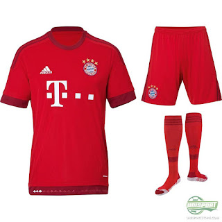
season they sported a home kit that popped on the TV screen due to its array of
vertical blue and red striping. For the new year, in a simplistic
fashion, Bayern have rid themselves of striping all together and are
going with a far more simplistic design that features just two shades of
red. The bulk of the kit, ranging from socks to shirt, is coated in their
signature fiery red, with a darker variation of it lining the ends of the sleeves,
bottom of the shirt, and the Adidas™ piping.
Although this new variation of red is new to the Bayern kit family, it does an excellent job bringing out the brightness of their classic red, which adds a major intimidation factor to the kit. An additional benefit of just the two shades of red is how it forces the blue in the team crest (featured on both the shirt and pants) to pop out far more than it would if it was surrounded by blue striping. Red is the club's primary color, but blue has been such an iconic color of their history for many years past, so even though the designers eliminated the blue stripes, they obviously knew how to keep blue a notable color of the club's kit.
Overall, these unsophisticated 2015/16 FC Bayern Munich home kits really please my creative side as their simplicity really grabs the eyes of viewers in a complex fashion.

No comments:
Post a Comment